So, you have your nice, shiny new repository. You've put a lot of effort into it to encourage your faculty to use it, perhaps even to learn to love it. You've made sure its
indexable by Google, followed the relevant accessibility guidelines and generally made sure it's doing its primary job: making your faculty's work as accessible as possible. You did do that, right?
UQ eSpace is the new incarnation of the University of Queensland's (AU) institutional repository which uses
Fez (a Web interface to
Fedora). Previously they were using
GNU EPrints 2. (At this point I should let you know I am an EPrints developer, but right now I'm talking with my
ROAR hat on.) I've picked on UQ eSpace as an example, but I think these criticisms hold for a lot of IRs out there.
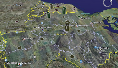
What has drawn my attention to UQ eSpace is the disappearance of their OAI interface. In December 2006 it disappeared, resulting in UQ eSpace no longer being trackable in ROAR. I don't keep a proactive eye on these things, so it can take a while for me (or someone else) to notice something's disappeared. Ok, so as the developer of ROAR it's time to go hunting for the OAI interface ...
But first, a little digression. In EPrints 3 we've added a note to EPrint's home page that gives the (human-readable) location of the OAI interface (e.g. see
http://demoprints3.eprints.org/). That makes my life (with ROAR hat on) a whole lot easier. NB EPrints was already the easiest of the repository softwares to locate the OAI interface for because it always resided at /perl/oai2, compared to e.g. DSpace with its combinations of 'request' 'dspace' and 'oai' terms in the OAI URL. When you have an index of 800-odd entries, consistency and obvious descriptive data are the difference between spending 10 seconds or 10 minutes editing an entry. Some people might suggest I should email administrators but that assumes an obvious point of contact is provided (again, rarely the case).
... back to the hunting. The first step in the trail of the OAI interface is whether its broken or gone. UQ eSpace returns a 404 at the ROAR-registered location (http://espace.library.uq.edu.au/oai). Not so good, but at least its a genuine 404 page. The interface has obviously gone and has been for a while. Next stop, the repository home page (http://espace.library.uq.edu.au/). All very pretty and familiar. Thumbs-up also for putting a clear description on the home page. But a scan of the home page shows no reference to OAI. How about Help? (I've not come across a site yet that provided the OAI interface in help, but one lives in hope)
Help documentation will be available here soon.
Hmm, not so good. Let's take a look at the software behind UQ eSpace. A search for Fedora and OAI throws up a
promising lead - try accessing /fedora/oai. 404. Oh dear. Perhaps the
Wiki for Fez might help?
In Fez 1.2 you have the option of configuring the Fedora OAI provider to provide access to your content.
Uh huh. So it exists, maybe, but where? Strangely enough I can find out the
OAI location for EPrints from that same Wiki. How about
Fez' documentation? 403 Forbidden. Hurumpf.
It's at this point I hang up my
deerstalker hat and smoking pipe. Perhaps the UQ eSpace OAI interface doesn't exist yet, but I wouldn't know either way. It's not difficult to help out services that want to promote you, you just need to put some clear guidance on your site: who are you? what do you contain? how do I harvest your content? how do I contact you? In fact, obvious stuff if you think about - it's what scholars having been doing for over a century.
Ordinarily I'd skip past UQ eSpace without comment but they've triggered another of my pet-hates. A well-designed, modern Web page should consist of well-structured content in HTML/XHTML and one or more style sheets that translate that content into the appearance you want. This enables better accessibility (for poor-sighted/disabled users), cross-browser compatility and cross-device compatibility (screens, printers, hand-held devices etc.). There are many accessibility benefits to this: the page is laid out in its logical structure, allowing screen readers to work, users can increase colour contrast and all text can be scaled by the user (vs. text rendered as images). I use a plugin for Firefox called
Web Developer that with a single keystroke can disable all styling on a Web page. My definition of a well-designed Web page is that when you disable styling, it falls out into a well structured, logical page. That means all the custom layout/colouring/backgrounds should disappear. Let's try my test on UQ eSpace's home page?
With styling UQ eSpace has a top bar, two columns and a bottom bar. This is a classic layout with high-level, little-used options and branding at the top (links to the institution, user-login functions), content and news in the two columns and technical data at the bottom (but no contact details). Fonts are changed to sans-serif and reduced in size (a little unfriendly to high-res screens). Various title bars have background colouring/images.
Without styling not a lot changes: the fonts revert to serif, links revert to their default colours. The column layout is generated through tables - which accessibility guidelines will tell you should only be used for data (allowing a screen-reader user to skip over large data sets). The top bar links are rendered as a single mapped image: for our poor-sighted user who can't read the (small) text-as-images, or is using a screen reader lets try disabling images. Unfortunately the university links now disappear completely (no ALT-tags). The backgrounds persist (which makes it difficult to get a high-contrast or printer-friendly version).
Why does this matter? Fez is being widely implemented in Australia and is promoted as a competitor to existing repository interfaces. I strongly believe that good Web design does not have to take longer or result in poorer interface design when compared to circa Netscape 5 technology. It does however require an appreciation of and adherance to standards - after all, that's what they're there for. Before I'm accused of throwing bricks in glass houses I do acknowledge that accessibility is tough but I've found modern XHTML/CSS Web design isn't difficult and can go a long way towards a better structured Web (if for no other reason than to get pages that are printer-friendly).
I hope UQ eSpace and the Fez developers will in future address both interoperability (i.e. where the heck is it?) and accessibility. I watch and wait with interest.


